Why 5cm in CSS may not be 5cm on screen
If you create a line in CSS, and specify that line should be 5cm long, would the line be 5cm when measuring the screen with a ruler?
In this post I’ll explain what I have just learned about the absolute units in CSS and why the answer of the above question sometimes is no. Examples of absolute units in CSS is inches (in), centimetres (cm) and points (pt).
Historical reasons
Back in the days it was common for screens to have 96 device pixels per inch (96 dppi). The first CSS spec allowed for the use of inches. In the implementations of CSS at that time, it made sense to map 1in to be rendered as 96 device pixels; that would ensure 1 CSS inch on (most) screens could be measured as 1 inch by a ruler. The spec of 1999 don’t specify that 1 inch should be mapped to 96 pixels, it actually mention reference pixels which means 1 inch actually shouldn’t be mapped directly to device pixels! Nevertheless, that was how the implementations did it.
With time the number of device pixels per inch started increasing. At first the physical units in CSS were required to display correctly according to W3C, but then:
“[…] as the number of incorrect implementations outnumbered correct ones and the situation didn’t seem to improve, CSS abandoned that requirement in 2011.”
- W3C
Since most implementations mapped 1 inch to 96 device pixels the inch would be smaller than the standard inch on screens with more than 96 device pixels per inch. Another problem was that people on their web pages had written 96px and 1in and assumed they were of equal length. The solution was the CSS pixel; a virtual layer of pixels between the absolute units and the device pixels. The CSS pixel size was defined as:
“The reference pixel is the visual angle of one pixel on a device with a pixel density of 96dpi and a distance from the reader of an arm’s length.”
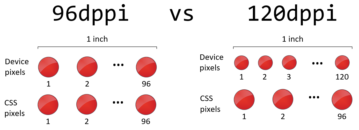
In other words, the CSS pixel should look the same for the viewer on different screens, no matter the device pixel density. The CSS pixel is made up of some number of device pixels. By defining 1 inch to be equal to 96px (CSS pixels) in the spec, the assumption 1in = 96px would continue to hold. The picture below illustrates that there are 96px (CSS pixels) in one inch no matter the device pixel density.
In practice
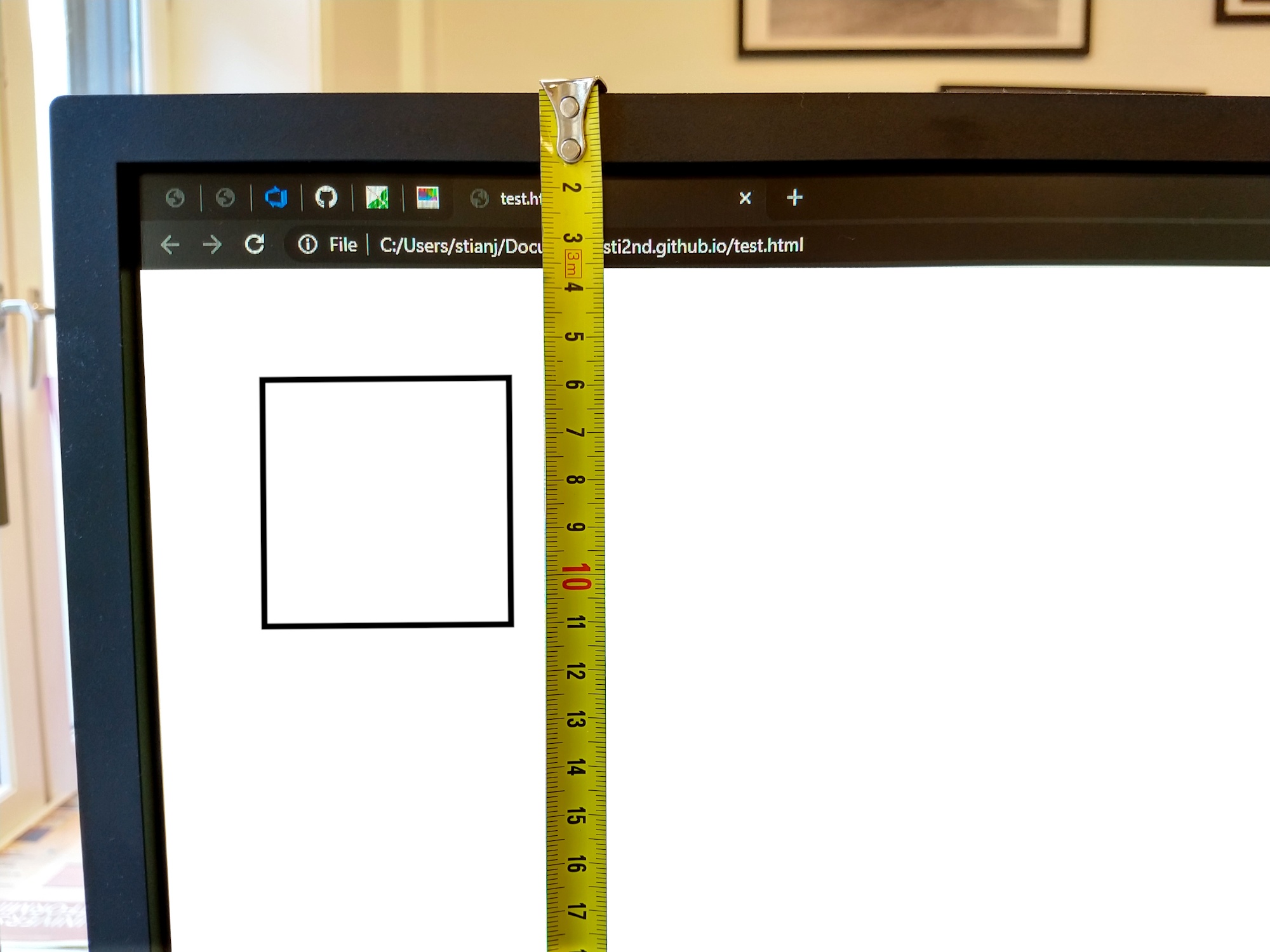
If you create a line in CSS, and specify that line should be 5cm long, you should be able to measure it to 5cm on print-out and on high-dpi screens. On low-dpi screens it may be wrong according to MDN, Webplatform and W3C. I believe the reason is because it would look bad to meet the requirement that 1in should render as 1 inch. Let’s say we have a low-resolution screen with 120dppi. Each CSS pixel would be rendered by (120 / 96 =) 1.25 device pixel. This means there would be anti-aliasing and web pages would probably look blurry. Wheras on a screen with 300dppi the CSS pixel would be represented by 3.125 device pixels. Since it is a high-dpi screen the device pixels are smaller and the anti-aliasing is thus less noticable.
In conclusion, on low-dpi screens CSS allows for mapping 1 CSS pixel to 1 device pixel to maintain sharpness, and sacrifices the correctness of the absolute units.
Last updated May 1 2020
Comments on this text? Create an issue on Github!